

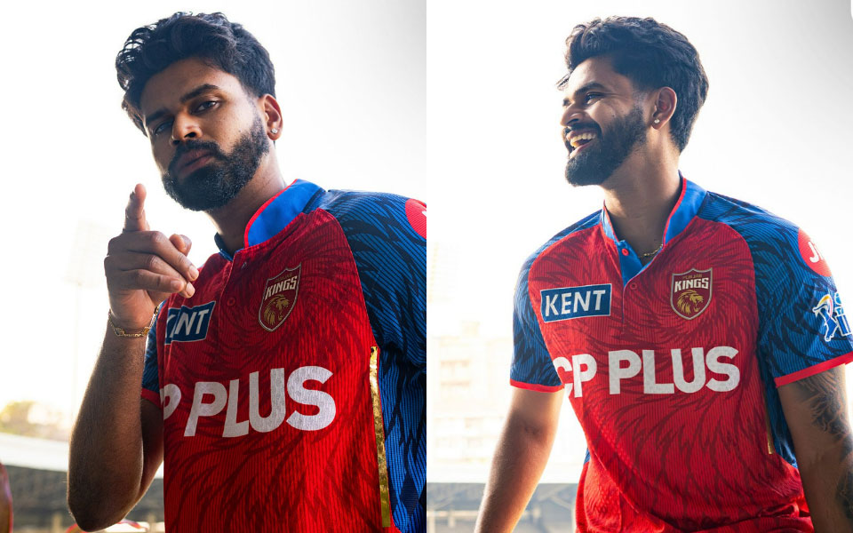
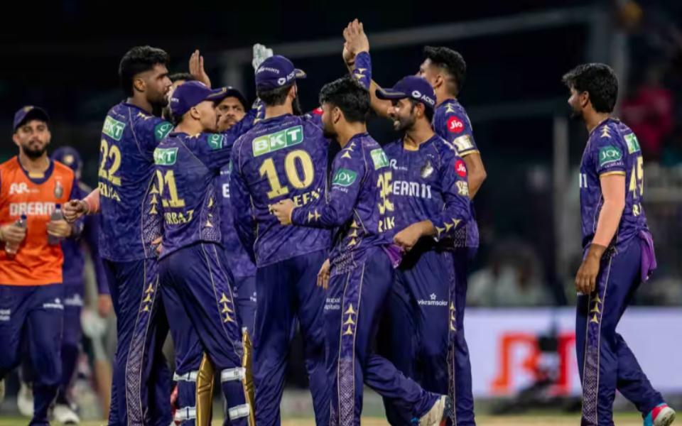
While only a few jersey designs in the Indian Premier League (IPL) have impressed fans over the years, most of the others have received negative reviews. Before every new season, IPL team jerseys see subtle changes. However, some teams have also made major changes to their jerseys. For example, Kolkata Knight Riders (KKR) had black and gold colors in the first two seasons before changing to purple and gold.
Chennai Super Kings (CSK), on the other hand, is one of the few teams that has made only subtle changes to their jersey over the years. However, many of the jerseys have not received a positive response from fans.
Aaqib Wani, the designer of India's current jersey, explains why IPL teams' jerseys have not lived up to fans' expectations. First, he said designers had to leave room for a long list of sponsor logos, taking into account the team's fixed colors and broadcast requirements. Giving the example of Formula 1 teams, he said that their jerseys also have many sponsors but still they look attractive.
Wani wrote on
He said, “Sponsors are the biggest challenges. Every brand wants its logo in basic colours, which makes it difficult to keep the jersey clean. Ideally there should be an integrated system. Look at F1 teams, the same number of logos, but often in the same color so that the overall look remains premium.”
Wani also pointed out that the quality of products is not always given much importance in India, especially in the IPL. He said that he had designed NBA jerseys which came to India also with the same quality. Therefore, he said that making quality products in India is not a problem.
Wani wrote, “Production is another limitation. Pattern making options are limited, fabric options are limited, and the quality that many factories produce for league kits is not always premium. It is not that India cannot produce a world-class product, it is just that it is not always considered necessary.”
“I have designed for the NBA with production in India, and the product turned out exactly as designed, fresh silhouette, international quality. So the potential is there. The difference is how much freedom and importance the design gets in the process. There is very little experimentation,” he said.
09:49 pm · March 12, 2026
The Hundred See: Vani
Lastly, Wani said The Hundred in England has bold and attractive jerseys and eye-catching graphics, while he called the IPL's approach “conservative”. In the end he said that the use of golden color should not be allowed in the IPL jersey. Many teams have adopted the color gold, either in the design of their jerseys or in the names and numbers printed on them.
“Look at The Hundred in England, the fresh colours, the bold identity, even the scorecards and graphics look new. The system in the IPL is more conservative, so most teams stick within a safe, familiar template. Personally, shiny gold in IPL jerseys should be banned – it's tacky!” Wani concluded.
Get every cricket update! Follow us: :


Leave a Reply